
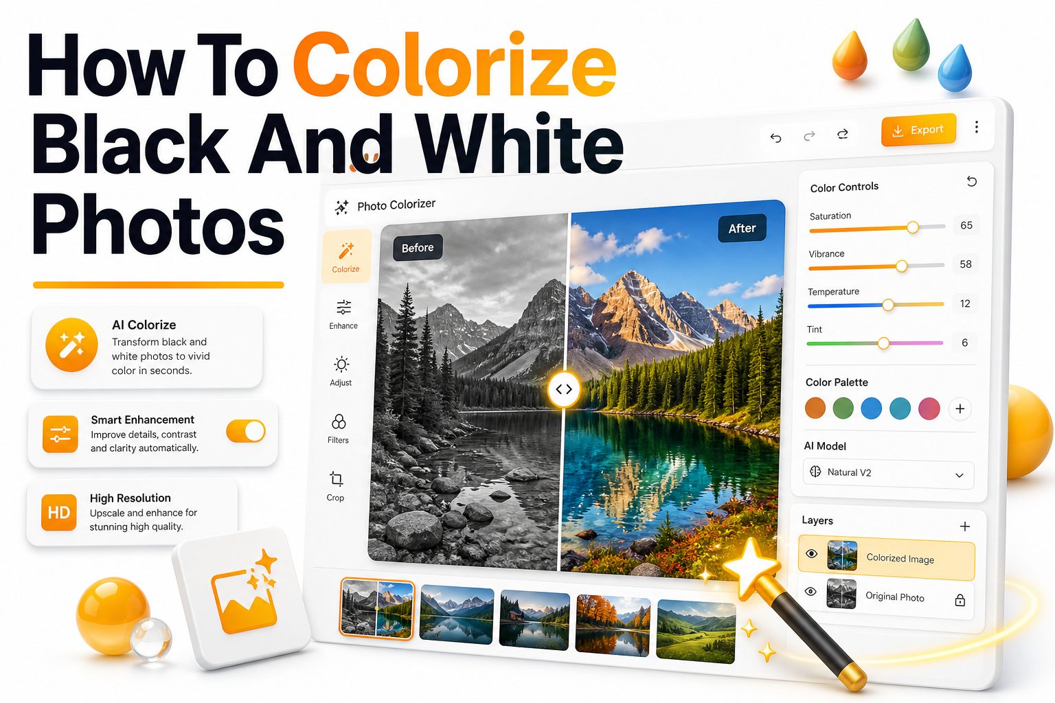
Old family portraits, historic street scenes, and vintage wedding photos often carry a kind of beauty that modern pictures cannot copy. Still, black and white images can feel distant, especially when the people in them are relatives, local figures, or moments from personal history. Adding color can make those images feel warmer, more immediate, and easier to connect with.
Learning how to colorize black and white photos is no longer limited to professional photo restoration studios. Today, you can use AI colorization tools, desktop editing software, mobile apps, or careful manual techniques to bring realistic color back into old images. The best results come from more than pressing one button, though. Color accuracy, skin tones, lighting, texture, and historical context all matter. This guide explains the practical ways to colorize old photos, how to choose the right method, and how to avoid the flat, artificial look that often gives poor photo colorization away.
Why Photo Colorization Still Matters
Colorized photos help people relate to the past in a more personal way. A black and white portrait may show expression and form, but color adds small emotional details such as eye color, clothing tones, background warmth, and seasonal atmosphere.
For families, colorization can make inherited photographs easier to share with younger generations. For historians, artists, and content creators, it can add context when handled responsibly. The goal is not to erase the original image, but to create a thoughtful version that feels alive.
What Colorization Can and Cannot Do
Photo colorization can add believable colors to skin, clothing, landscapes, buildings, and objects. Modern tools can estimate tones using image patterns, training data, and context, often producing results within seconds for clear portraits and simple scenes.
However, colorization cannot always know the exact original colors. A dress may have been blue, green, or burgundy, and an AI tool may only guess. For historically important images, colorized versions should be treated as interpretations unless verified by records or references.
Key benefits of colorizing old photos:
- Makes family photos feel more relatable and personal
- Adds visual interest for archives, blogs, and presentations
- Helps damaged or faded photos look more complete
- Creates shareable versions for social media and albums
- Supports creative projects, documentaries, and memory books
- Gives portraits more warmth without replacing the original
Choose the Right Photo Before You Start
A clean, high-resolution scan gives you the best starting point. Images with sharp faces, clear clothing edges, and visible background details are much easier to colorize than blurry, heavily scratched, or low-contrast photos.
If you only have a small print, scan it at 600 DPI when possible. Avoid taking a quick phone photo under uneven lighting. Reflections, shadows, and lens distortion can confuse colorization tools and make later editing harder.
Prepare the Image for Better Results
Before adding color, fix obvious damage such as dust, scratches, stains, and faded contrast. A photo that looks clean in black and white usually produces more natural color because the software can read shapes and tones more accurately.
Basic preparation may include cropping, straightening, adjusting exposure, sharpening soft details, and repairing torn areas. You can learn more about improving old images before editing through [Internal Link: Photo Restoration Tips], especially if the original print is badly aged.
Basic preparation checklist:
- Scan the photo at the highest practical resolution
- Save an untouched copy before editing
- Remove dust, scratches, and stains first
- Correct faded contrast and exposure
- Straighten tilted portraits or borders
- Crop only after preserving the full original
- Export a working copy in PNG or TIFF format
Use AI Tools for Fast Photo Colorization
AI colorization tools are the easiest option for beginners. You upload a black and white image, the tool analyzes faces, objects, and scenery, then generates a color version automatically. Many tools work especially well for portraits with clear facial features.
The main advantage is speed. You can colorize black and white photos in seconds and use the result as a finished image or a starting point. The downside is that AI may choose odd colors, miss small objects, or make skin tones look too smooth.
Best Use Cases for AI Colorization
AI tools work best on portraits, street photos, wedding pictures, school images, and simple outdoor scenes. These images contain familiar patterns such as faces, grass, sky, wood, and fabric, which automated systems can color with reasonable confidence.
They are less reliable for military uniforms, historical fashion, rare objects, stage costumes, and images with complex lighting. In those cases, AI can still help, but you may need manual corrections to improve accuracy and realism.
Manual Colorization for More Control
Manual colorization gives you the most control over the final look. Instead of relying entirely on software guesses, you paint color onto separate layers and blend it with the original tones. This method is slower but often produces richer, more believable results.
Photo editors such as Photoshop, Affinity Photo, GIMP, and similar tools allow you to use blend modes, masks, brushes, and opacity settings. You can build color gradually, adjust each area separately, and keep the original shadows intact.
AI vs Manual Colorization:
Method: AI colorization
Best for: Quick portraits and simple scenes
Main advantage: Fast and beginner-friendly
Main drawback: Less control over exact colors
Method: Manual colorization
Best for: Detailed restoration and historical images
Main advantage: High control and accuracy
Main drawback: Takes more time and skill
Method: Hybrid colorization
Best for: Most personal and professional projects
Main advantage: Fast base with manual refinement
Main drawback: Requires extra editing after AI output
Method: Professional service
Best for: damaged or valuable images
Main advantage: Expert restoration and color judgment
Main drawback: Higher cost than doing it yourself
Use a Hybrid Workflow for Realistic Results
A hybrid workflow often gives the best balance between speed and quality. You can start with an AI-generated color version, then manually correct problem areas such as skin, lips, clothing, hair, eyes, and background details.
This approach saves time because the first color pass is already done. Instead of painting every area from scratch, you focus on improving realism. For most family photos and personal projects, this is the most practical way to work.
Build Color in Separate Layers
Separate layers make editing easier and safer. Use one layer for skin, another for hair, another for clothing, and more for backgrounds or objects. If one color looks wrong, you can change that area without damaging the rest of the image.
Layer-based editing also helps you control subtle differences. Skin should not have the same saturation as a red coat or green grass. Keeping each color area separate allows you to reduce intensity, adjust hue, and preserve natural variation.
Tips for a realistic hybrid workflow:
- Start with AI only as a base, not the final answer
- Correct skin tones before editing clothes or backgrounds
- Use low opacity brushes for gradual color buildup
- Keep shadows and highlights from the original photo
- Add slight color variation to cheeks, lips, and hands
- Compare your edit at full size and zoomed out
- Save layered files before exporting a flattened image
Get Skin Tones Right
Skin tone is usually the most important part of photo colorization. If the face looks wrong, viewers will notice immediately. Good skin color should follow the original light and shadow, with gentle variation across cheeks, forehead, lips, hands, and neck.
Avoid using one flat peach or brown color across the entire face. Real skin contains warm, cool, red, yellow, and neutral tones. A low-saturation base with careful warmth in the cheeks often looks more natural than a bright, polished finish.
Match Skin to Lighting
Lighting affects skin color more than many beginners expect. A portrait taken outdoors may have cooler shadows and warmer highlights, while an indoor studio portrait may look softer and slightly muted. Color should respect the original light source.
If a face has strong shadows, do not brighten those areas with color alone. Let the black and white image keep its depth. Color should sit inside the existing tonal structure rather than cover it.
Color Clothing with Context
Clothing can add character, but it can also make a colorized image look fake when overdone. Start with muted, believable tones unless you have evidence that a garment was bright or patterned. Older clothing dyes often appeared softer in photographs.
Look for clues before choosing colors. Wedding dresses, military uniforms, school clothes, workwear, and formal suits often follow predictable conventions. Family stories, dates, locations, and similar period photos can help you make better choices.
Research Helps Improve Accuracy
Historical research is useful when colorizing old photographs from a specific era. Clothing styles, military insignia, car paint colors, wallpaper trends, and regional architecture can all guide your decisions and prevent obvious mistakes.
You do not need academic research for every family photo, but a few reference images can make a major difference. For heritage projects, consider keeping notes about which colors are verified and which are creative estimates.
Useful references for color decisions:
- Family descriptions and written notes
- Similar photos from the same album
- Military or school uniform records
- Fashion catalogs from the same decade
- Local history archives and museum collections
- Color postcards or advertisements from the period
- Original objects, fabrics, medals, or keepsakes
Restore Contrast Before Adding Color
Color works best when the black and white foundation has strong but natural contrast. If the original photo is faded, gray, or washed out, the final colorized version may look weak even after adding color.
Adjust contrast carefully before colorization. Bring back detail in faces and clothing without crushing shadows or blowing out highlights. A balanced tonal range gives color something solid to attach to and helps the finished image look photographic.
Avoid Over-Sharpening Old Photos
Sharpening can help soft scans, but too much sharpening creates rough edges, halos, and gritty skin. These problems become more obvious after color is added because color draws attention to texture and facial details.
Use sharpening lightly and only after cleaning major damage. If the image contains film grain, try to preserve some of it. Removing every bit of texture can make the photo look plastic, especially in faces and fabric.
Common mistakes to avoid:
- Adding color before repairing major damage
- Making skin tones too orange or too pink
- Using bright modern colors without context
- Ignoring shadows from the original image
- Applying the same color intensity everywhere
- Exporting only a low-resolution final file
- Deleting the original black and white version
Use Mobile Apps for Simple Projects
Mobile apps are useful when you want a quick colorized version for sharing. Many apps can scan, clean, and colorize photos from a phone, making them convenient for casual family albums and social media posts.
The limitation is control. Small screens make it harder to correct fine details, and app exports may compress the image. For important photos, use a desktop workflow after scanning the original properly.
When Mobile Editing Makes Sense
A mobile app is fine for previewing how a photo might look in color. It is also helpful when working with relatives who want to see quick versions from an album during a visit or family event.
For keepsake prints, framed gifts, or archive-quality files, move the image to a computer. A larger screen and layered editing tools make it easier to catch color spills, uneven tones, and small restoration issues.
Use Desktop Software for Higher Quality
Desktop photo editors offer stronger control over layers, selections, masks, color balance, and export settings. This matters when the image has fine hair, lace, jewelry, furniture, patterned clothing, or complicated backgrounds.
A desktop workflow also gives you better file management. You can keep the scan, cleaned version, AI version, layered edit, and final export organized. For repeated projects, this saves time and protects the original material.
Desktop workflow essentials:
- Use TIFF or PNG for editing whenever possible
- Keep the original scan in a separate folder
- Create layers for each major color group
- Label layers clearly as you work
- Use masks instead of erasing pixels permanently
- Export JPEG only for sharing or web upload
- Keep a high-quality master file for future edits
Keep Colors Subtle and Believable
The strongest colorized images usually have restraint. Old photos often look more convincing with slightly muted colors, because the original lighting, film stock, and texture were not designed for modern color intensity.
If an image starts to look too polished, reduce saturation and check the result again. Skin, fabric, wood, sky, and grass should not compete equally for attention. The viewer’s eye should still go to the subject first.
Balance Warm and Cool Tones
Natural photos contain both warm and cool tones. If every area leans warm, the image can look yellow or artificial. If every area leans cool, faces may appear lifeless and the scene may feel detached.
Use warmer tones for skin, sunlight, wood, and certain fabrics. Use cooler tones in shadows, metal, stone, and distant backgrounds. This balance helps the colorized photo feel closer to a real captured moment.
Practical color tips:
- Lower saturation before increasing it
- Add warmth to highlights, not every shadow
- Keep backgrounds slightly quieter than faces
- Use cooler tones in deep shadow areas
- Avoid pure black, pure white, and pure red
- Check the image on more than one screen
- Print a test copy if the final version will be framed
Colorize Backgrounds Carefully
Backgrounds support the subject and should not overpower the image. Walls, curtains, gardens, furniture, and streets can add atmosphere, but they need softer handling than faces and important objects.
If you are unsure about a background color, choose neutral tones. Pale walls, muted greens, soft browns, and gentle grays often look more credible than bold colors. A quiet background also helps portraits remain the focus.
Use Background Details as Clues
Small background details can tell you a lot. Outdoor scenes may reveal season, region, building materials, or time of day. Indoor photos may show wallpaper, rugs, furniture, or painted studio backdrops.
Use these clues to guide your choices. For example, a garden portrait may need different greens depending on whether the plants are in bright sun or shade. A studio portrait may need a softer, less literal background color.
Handle Hair, Eyes, and Lips with Care
Hair color should follow the light and texture of the original image. Do not paint one solid brown, blonde, black, or gray layer over the entire head. Use the black and white tones to preserve strands, highlights, and depth.
Eyes and lips need even more restraint. Overly bright blue eyes or red lips can make a vintage portrait look theatrical. Soft, low-opacity color usually works better, especially when the original photo has delicate facial detail.
Small-detail editing checklist:
- Zoom in for edges, then zoom out for realism
- Keep lips close to natural skin tones
- Add eye color softly and avoid glowing effects
- Let gray hair keep silver or neutral variation
- Paint hair with low saturation first
- Clean color spills around ears, collars, and hats
- Compare facial details before and after editing
Export the Final Image Correctly
A good colorization project deserves the right export settings. Save a layered master file first, then export separate versions for print, sharing, and web use. This prevents quality loss and keeps future edits possible.
For printing, use a high-resolution file with minimal compression. For websites, use a properly sized JPEG or WebP file. If you publish restored family images online, consider adding context through [Internal Link: Old Photo Editing Guide] so readers know how the result was created.
Keep the Original Version Safe
Always preserve the untouched black and white image. Colorization is an interpretation, and you may want to revisit the photo later with better tools, new family information, or improved editing skills.
Store the original scan in more than one place if the photo is important. Cloud storage, an external drive, and a local folder can protect family history from accidental loss. Label files clearly so versions do not get mixed together.
Recommended file versions to keep:
- Original scan
- Cleaned black and white restoration
- AI colorized draft
- Layered manual edit
- Final print version
- Final web version
- Notes about color choices and references
Use Colorization Ethically
Colorizing personal photos is usually straightforward, but historical images require more care. A colorized version can influence how viewers interpret people, places, uniforms, flags, and events. Accuracy matters when images are used for education or publication.
If you share historically significant colorized photos, mention that the colors are interpreted unless verified. This simple note protects trust and helps viewers separate documented fact from artistic restoration.
Respect Family and Cultural Context
Family photos can carry emotional weight. Before colorizing sensitive images, consider how relatives may feel about changes to portraits, memorial images, religious scenes, or culturally important clothing.
A respectful approach keeps the original intact, avoids exaggerated effects, and treats colorization as a companion version. When possible, ask older relatives about clothing, locations, and memories. Their details can make the final image more accurate and meaningful.
Ethical colorization guidelines:
- Keep an untouched original copy
- Label interpreted colors when accuracy is uncertain
- Avoid changing identity, symbols, or cultural details
- Do not present colorized history as exact fact
- Ask family members before editing sensitive images
- Credit archives, photographers, or collections when required
- Use color to support the image, not rewrite it
Print and Share Colorized Photos Well
Printed colorized photos can make thoughtful gifts, but print output often differs from what you see on screen. Colors may appear darker, warmer, or less saturated depending on the paper, printer, and display calibration.
Before ordering a large print, test a smaller version. Matte paper often suits vintage portraits because it reduces glare and supports softer tones. Glossy paper can work for sharper scenes but may make restoration flaws more noticeable.
Create Digital Albums with Context
Digital albums are a practical way to share colorized photos with family. Include the original black and white version beside the colorized image when possible. This gives viewers a clear sense of the restoration work.
Add names, dates, places, and short notes where available. Even simple captions can turn a colorized photo into a useful family record. Over time, these details may become as valuable as the image itself.
Sharing ideas for colorized photos:
- Family history albums
- Framed anniversary gifts
- Memorial slideshows
- Genealogy websites
- Local history blog posts
- Classroom presentations
- Before-and-after restoration galleries
Best Practices for Natural Results
The best way to colorize black and white photos is to combine good preparation, restrained color choices, and careful final review. Do not rush the process if the image matters. Small corrections often separate amateur results from polished restoration work.
Work from the most important areas outward. Start with faces, hands, and clothing, then move to backgrounds and minor objects. Review the whole image at normal viewing size, because a technically detailed edit can still feel wrong when seen as a complete photo.
Develop Your Eye Over Time
Photo colorization improves with practice. The more you study real color photography, old films, historical references, and professional restorations, the better your judgment becomes. You start noticing when colors are too clean, too bright, or too uniform.
Keep comparing your work against real photos from similar eras. This habit helps you build a reliable sense of color balance, texture, and atmosphere. Over time, your edits will look less like color added later and more like natural photographs.
Final quality checklist:
- Skin tones look natural in highlights and shadows
- Clothing colors match the era and context
- Background colors support the subject
- No obvious color spills appear around edges
- Saturation feels restrained rather than bright
- Original texture and grain remain visible
- The black and white original is safely stored
Conclusion
Colorizing old photos is part technical editing, part visual judgment, and part respect for the image’s history. Fast AI tools make the process easier than ever, but the most convincing results still come from careful preparation, subtle color choices, and a willingness to refine details by hand.
Whether you are restoring a grandparent’s portrait, improving an archive image, or preparing visuals for a family history project, the same principles apply. Start with the best scan you can make, clean the photo before adding color, research when accuracy matters, and keep the final tones believable. Most importantly, preserve the original black and white file so the colorized version remains one thoughtful interpretation rather than a replacement.
With the right workflow, learning how to colorize black and white photos can turn distant images into vivid, personal records while keeping their original character intact.
FAQ
What is the easiest way to colorize old photos?
The easiest method is to use an AI photo colorization tool. Upload a clear black and white image, generate a color version, then make small manual corrections if needed for skin tones, clothing, and background details.
Can AI colorize black and white photos accurately?
AI can create believable colors, especially for portraits and common scenes, but it cannot always know the original colors. For historical or family accuracy, use references such as notes, similar photos, uniforms, or relatives’ memories.
Should I restore a photo before colorizing it?
Yes. Cleaning scratches, stains, fading, and contrast problems first usually improves the final result. A damaged or washed-out image gives colorization tools less detail to work with and may produce uneven or muddy colors.
What file format is best for colorized photos?
Use TIFF or PNG while editing because they preserve quality better than compressed formats. Export JPEG or WebP copies for websites and sharing, but keep a high-resolution master file for printing or future edits.
Can colorization damage the original photo?
Digital colorization will not damage the physical photo if you scan it first and edit a copy. Always keep the original scan untouched, then create separate working and final files for restoration and color editing.
0 Comments